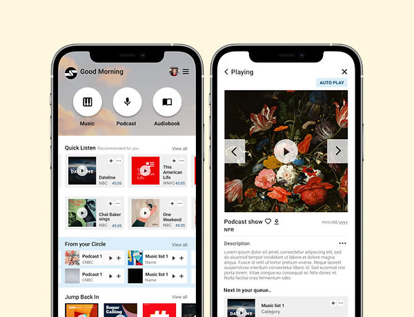
Case study :
Soundscape
(Mobile Application)
Soundscape is an application that helps users listen to, discover, and share audiobooks, music, and podcasts with people in their circle.
Problems, Needs and Possibilities :
- Busy commuters /professionals do not have time to browse through a large amount of content but still want to find something that is related to their interests.
- The need to toggle between music, podcast, and audiobook according to different activities during the day.
- The need to keep up with friends and people in their circle on the topic of what they are listening to.
Goal :
Design an application that...
1. Helps keep users in the loop of what friends are listening to.
2. Toggle between music, podcasts, audiobooks, and share contents
3. Helps provide inspiration from influencers in users' interest areas.
4. Helps users access content quickly

My role in the project :
UX/UI designer and researcher and all processes from conception to delivery.
Responsibilities :
User research, Market competitive audit, User Journey, paper and digital wireframing, lo-fi
and hi-fi prototyping, conducting usability
studies, design iteration, etc.,
User research summary and Target audience
I conducted interviews and created empathy maps to understand the users I’m designing for and their needs.
A primary user group identified through research was working adults who need to listen to different media during different activities and share what they are listening to people in their circle while able to get inspired by influencers.
This user group confirmed initial assumptions about our research, but research also revealed that users might also need to use the app accompany by other devices according to different activities throughout the day such as desktops, smartwatches, earphones, and cars.
Persona A :

Persona B :

Design phase :
Paper Wireframe
Initial Concept :
I started the wireframe with user pain points, possibilities, and a market gap in mind.
For the home screen, I prioritized Quick access modes which are Quick listening mode, From your circle mode, and Jump back in mode to help users discover/access the content that they want with less browsing time.

Design phase :
Digital Wireframe
In the initial design phase,
I made sure to base screen designs on feedback and
findings from the user research.
- Four quick access types on the home screen


Design phase :
Low-Fi Prototype
Using the completed set of digital
wireframes, I created a low-fidelity
prototype.
The main user flow was for users to select one type of content to play, create and share a playlist then share it with people in their circle.
View Soundscape
low-fidelity prototype

Usabilities Testing and Refining the design:
Before and After
usability changes
After I received feedback from the usability testing, I made some changes to the main menus (grouping), increase the size of the buttons, and added more information to the media.


